Before
|
After
|
Project Description:
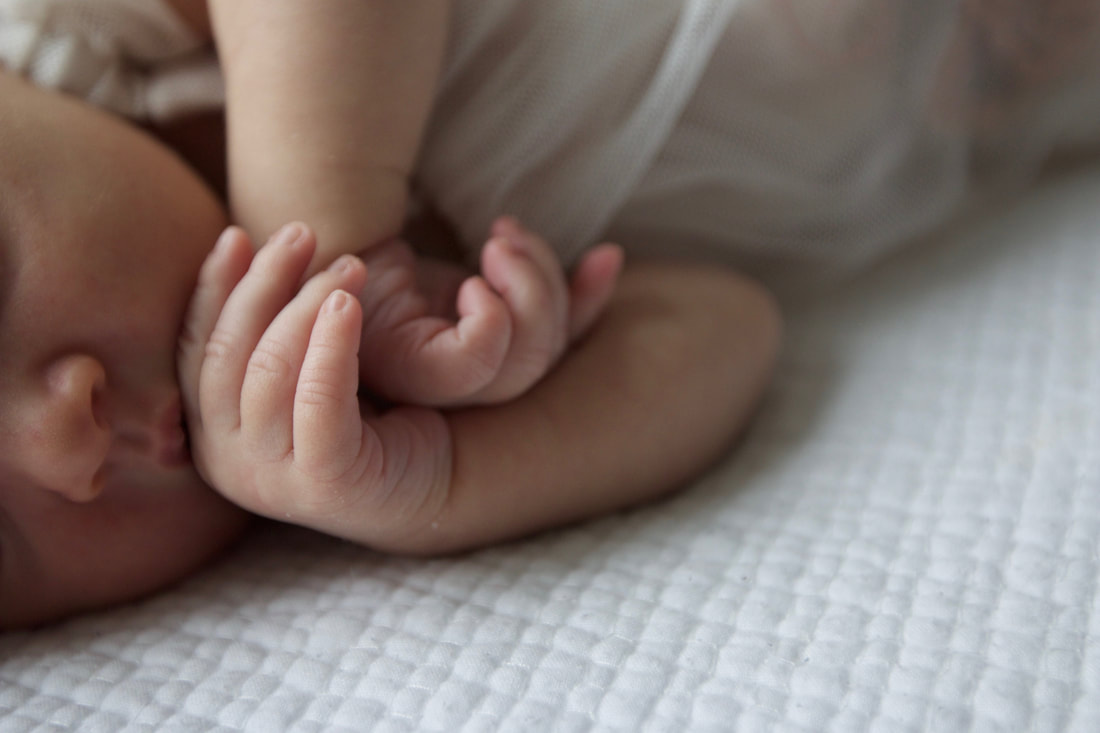
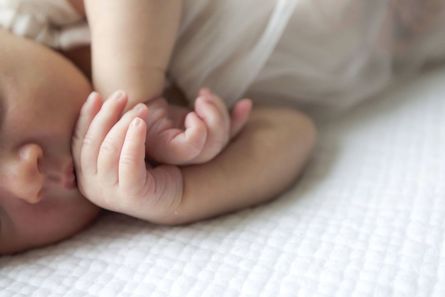
The original picture of these delicate baby hands is very beautiful and soft. I wanted to lighten it up and make the picture more bright in order to reflect more of an angelic feeling when looking at the image. Through strengthening the white tones within the image I was able to give it more of the specific feel I was desiring. Also by amping up the contrast, detail and clarity helped make the overall image pleasant and aesthetically appealing.
Exposure +.70
Contrast +15
Shadows +43
Whites +44
Clarity -24
Detail 45
Luminance 55
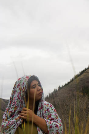
Before |
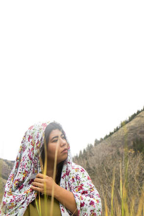
After |
Project Description:
Here is another picture that I decided to edit using Adobe Bridge. I absolutely love the natural elements in this picture and the emotion one may feel when viewing it. It tells a story. What do you think she is thinking in this moment? Is she lost? Where is her gaze? I wanted to brighten the picture to have a washed out background so I could capsize on the negative space and bring up the whites. I also felt like it was important to sharpen and add a touch of contrast to bring out the details in her clothing and maker her facial features more clean. Being able to edit photos well is important for personal and professional use.
Exposure +1.05
Contrast +25
Highlights +73
Shadows +16
Whites +52
Clarity -4
Detail 35
Luminance 10

I feel like simplicity is the key to design. I wanted to add flat vector icons in order to achieve the simple look I was trying to portray but also wanted to add an edited Utah State symbol to incorporate Aggie Spirit and the USU Stars theme. I think typography is beautiful and can stand alone - not much needs to be done to it in order for it to look good. I wanted to start from left to right so when the person reads this flyer they feel motivated and impressed to chase their dreams and work hard to achieve their goals. I feel as if there is a nice flow to the flyer and that the negative space allows it to have a clean and fresh effect.
Notes: In order to create this design I found an image on the Utah State University website and edited in Camera Raw. I then cut it out in Photoshop using the quick-selection tool so it did not have any background and placed it here adding a special effect to make it more of a transparent object within the design.
Notes: In order to create this design I found an image on the Utah State University website and edited in Camera Raw. I then cut it out in Photoshop using the quick-selection tool so it did not have any background and placed it here adding a special effect to make it more of a transparent object within the design.
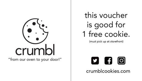
I made this business voucher for the new company in Logan called Crumbl. It is a cookie delivery company that delivers warm cookies to residents from 8:00 PM - 2:00 AM. They have a fun storefront located in the old Crepery building and offer multiple cookies options with Chocolate Chip being their staple cookie.
I wanted this design to be very simple and clean. The company wanted to keep printing costs low so I only used black ink. With this project I really wanted to work on alignment and spacing in order to make all the wording look very clean cut and aesthetically pleasing to the eye. I felt like it was important to stick with the same typography/font as their Crumbl logo which would make everything uniform.
I wanted this design to be very simple and clean. The company wanted to keep printing costs low so I only used black ink. With this project I really wanted to work on alignment and spacing in order to make all the wording look very clean cut and aesthetically pleasing to the eye. I felt like it was important to stick with the same typography/font as their Crumbl logo which would make everything uniform.

I aim to keep every design simple and to the point. I find power in minimalism and think negative space draws the eye to important information. I love the University of Utah's rich red color and wanted to utilize it within the design as well as emphasize the word "YOU" so that it was slightly hanging off the page. I chose a simple text that was edgy and sharp to make it pop off the page. I do not believe that a graphic is needed and I wanted to incorporate a more modernized feel as I felt it would relate well with technology. I am a strong believer that a good poster does not need every single detail on it, that is why I chose the most important things such as Who, What, When, Where, Why and put it all neatly in the right bottom corner. The viewer will read from left to right and understand to find out more they will need to visit www.ucet.org.
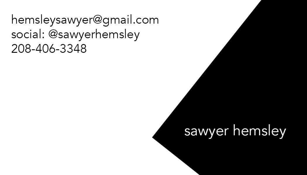
I like to keep things simple. Black and white are very signature for me and I love the clean and sharp lines of this shape. It's edgy, yet cool and professional. When I design I use clean angles to obtain the look I'm looking for - I'm not a huge fan of busy and colorful business cards.
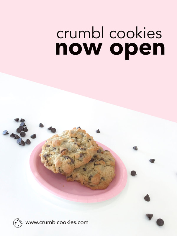
I have been working with Crumbl Cookies and their marketing team. We are constantly in need of new flyers that are fresh, clean and themed with the company colors pink and white. In this flyer announcing the opening of the store I decided to keep it simple. I edited the photo within Camera Raw but bumping up the exposure and contrast as well as accenting the whites. I wanted the cookies and feel of the poster to have a light glow so I also bumped up the luminance. I love the clean alignment of the wording and utilized the company font - which is very minimalistic. I used the quick selection tool and then carried over the newly selected layer onto a pink background.
|
|